Nééré
Service
Identité visuelle
Direction artistique
Impression
Design graphique
Identité de marque
Création de nom
Secteur
Soins de santé
Éducation
Industrie du sport
Contexte
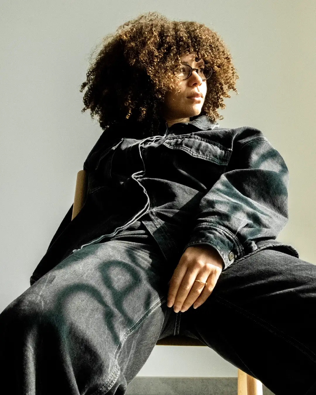
Véronique Pirotton, a certified nutritional therapist specializing in women's nutrition, prevention, and feminine balance, was operating in a highly competitive sector where practitioners multiply without clear differentiation. Drawing on solid experience and also teaching prenatal and postnatal yoga classes, she supports women through hormonal disorders, fertility, pregnancy, and menopause with an approach combining nutrition, environmental detoxification, and movement. She wanted to create branding that matched the power she knows women possess. Her ambition was to surround herself with a team that understood her values to fully express the uniqueness of her expertise in preventive feminine nutrition. The challenge was substantial: creating a brand identity that authentically reflects Véronique's power and expertise, while developing accessible and differentiating communication that speaks to all women seeking personalized solutions.
The challenge was multifaceted: gaining buy-in for the Nééré project by creating a strong and unifying identity, building a genuine community of women around the values of preventive nutrition and hormonal balance championed by Véronique, and completely rethinking the positioning to structure a coherent multi-service offering. The positioning challenge was central as it required orchestrating several complementary services under one banner while maintaining clear readability. How do you transform individual expertise into a complete support ecosystem? How do you create the conditions for an engaged community that shares the same aspirations for natural health and feminine empowerment? From a business perspective, the objective was to increase visibility and recognition of expertise to attract qualified clients ready to commit to a support journey. It was also necessary to create a solid growth platform to structure and develop the diversified service offering toward workshops, conferences, and group support programs.
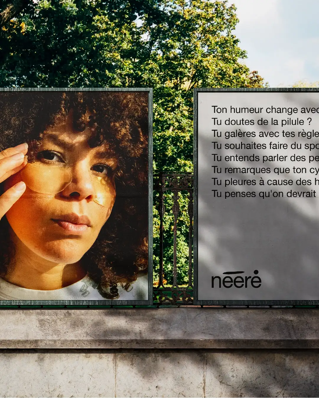
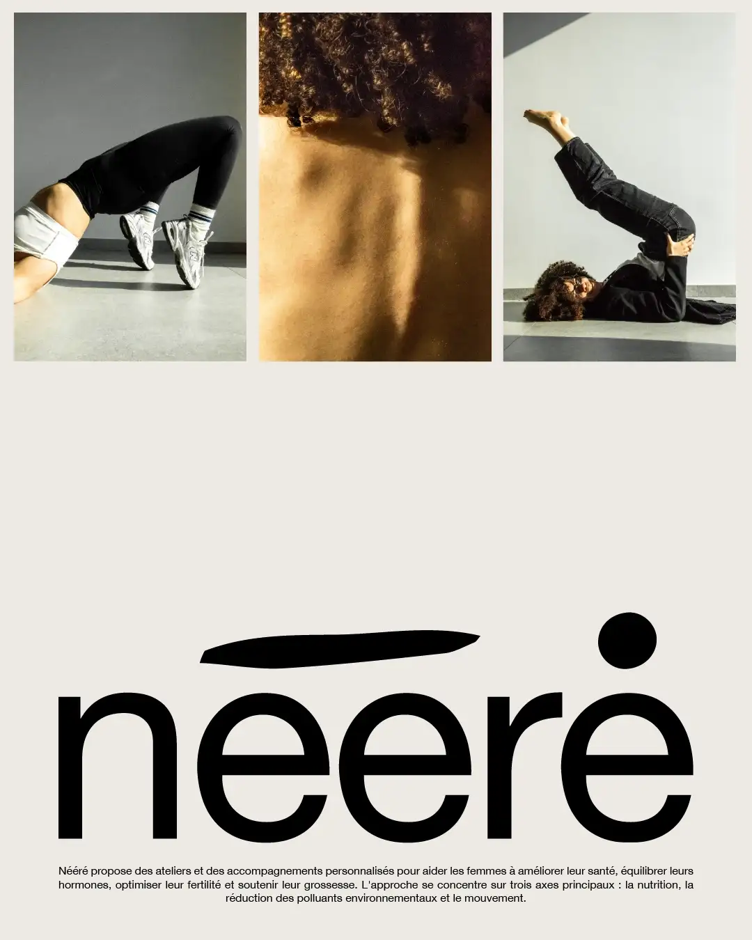
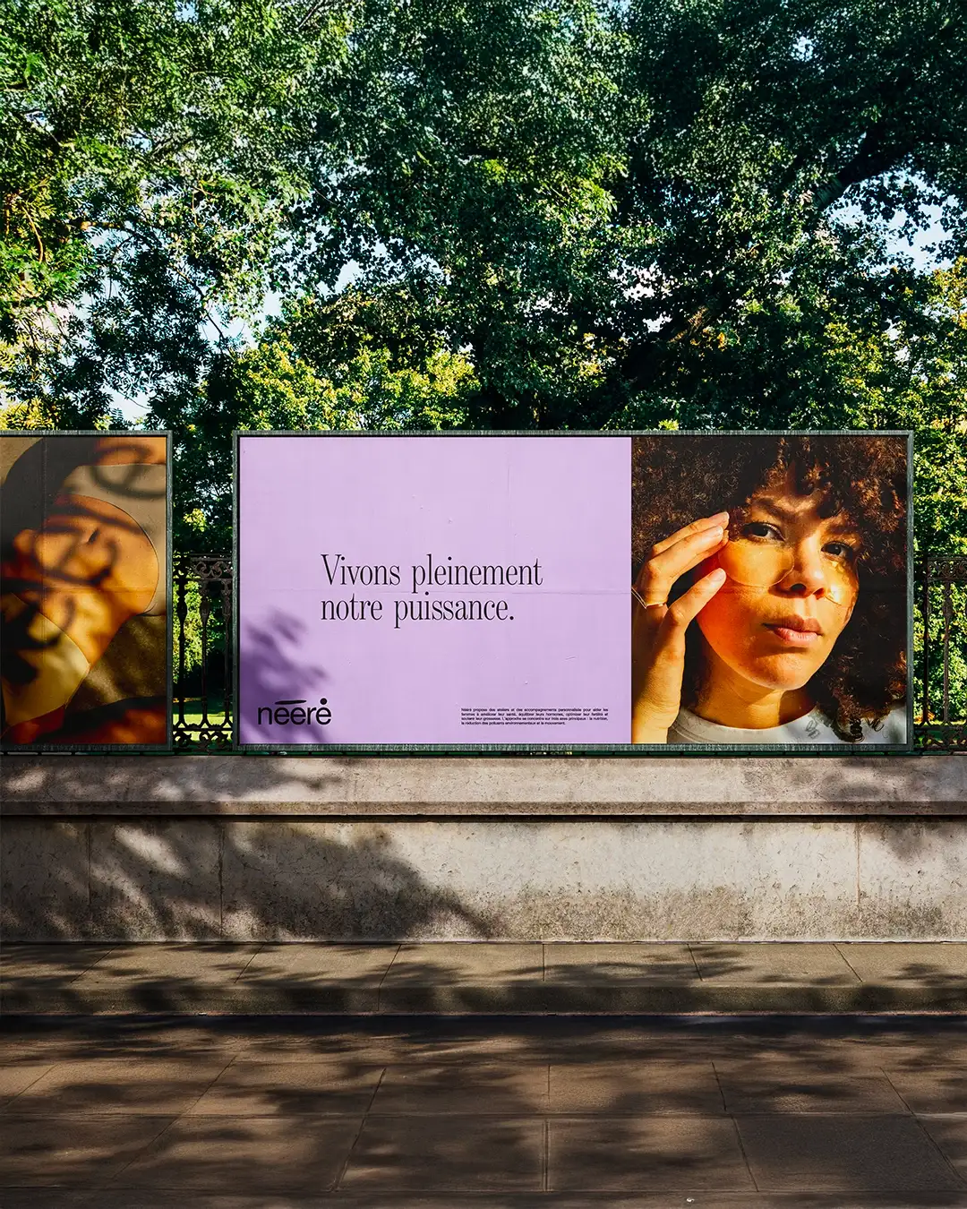
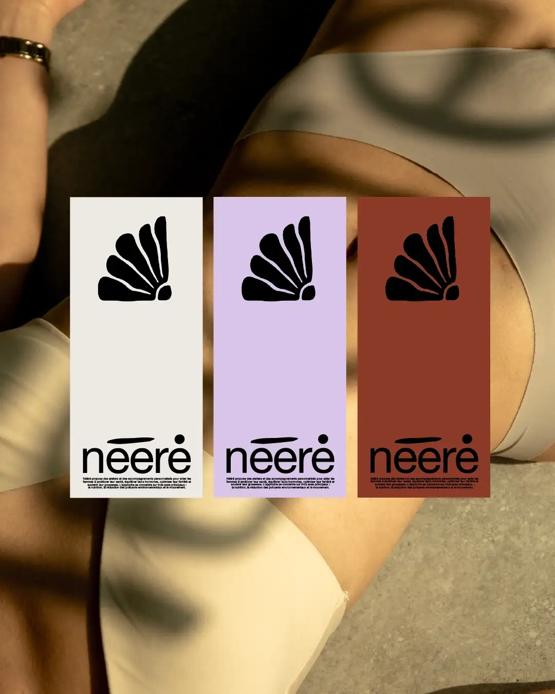
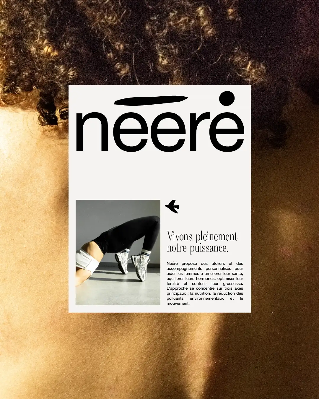
We developed a naming strategy around "Nééré," an evocative name that combines several symbolic dimensions. Nééré draws from Véronique Pirotton's African heritage, a powerful word that embodies woman, strength, and ancestral feminine power. The workshop evokes a space of creation, transformation, and personalized learning. The mention "for women" affirms a clear and confident positioning. The strategic repositioning places Véronique at the center of her branding. She carries, lives, and fully manifests Nééré's values, authentically embodying the transformation she offers her clients. We structured a clear offering that allows women to choose the format that suits them: individual consultations, thematic workshops, or inspiring conferences. The visual identity developed uses highly visual codes, creating a subtle balance between strength and softness while prioritizing great readability. The tone of voice reflects Véronique's personality: contemporary and non-prescriptive, sometimes raw and slightly rebellious, but always benevolent and expert.
The identity created has generated remarkable transformations. The community of women around Nééré has grown considerably, revealing exceptional engagement and loyalty that testifies to the relevance of the positioning developed. Véronique's professional recognition has materialized through her appointment as a speaker and trainer at a renowned higher education institution, legitimizing her expertise and strengthening her credibility in the sector. This evolution demonstrates that the brand identity created has successfully carried her vision beyond her individual practice. The development has also resulted in Nééré's integration within a multidisciplinary medical and paramedical practice, marking recognition by peers and opening new prospects for professional collaboration. As Véronique Pirotton testifies: "Thanks to this repositioning, I no longer present myself as 'just another nutritional therapist' but as THE specialist in preventive feminine nutrition. My clients now arrive convinced, and my rates are never questioned anymore."
